This article was written by Tina Poethe, Product Designer at SPREAD AI.
Building AI-assisted workflows for engineers requires powerful tools and a visual language that supports them. When interfaces are expected to guide through complex tasks, even small inconsistencies can introduce friction. One such subtle but surprisingly impactful barrier we noticed over the past year was how fragmented our use of icons had become. This article reflects on how this fragmentation emerged and what it took to address it.
As the platform grew, different parts of the product evolved independently. Along the way, we accumulated nine different icon libraries, each selected to solve an immediate local need. Little attention had been paid to how those choices interacted across the platform as a whole. While this worked in the short term, signs of friction accumulated over time: Inconsistencies across dashboards and panels, and confusion about icon meaning in workflows involving Product Twins and Agents.
Why icons matter
Icons may appear secondary, but in complex systems they serve as interpretation layers. The interface isn’t just about triggering actions—every visual element shapes how users reason about the system. Each icon acts as a cue:
-
Is this a warning or informational signal?
-
Does this represent an automated agent or a user-controlled step?
-
Is this a core workflow element or a peripheral action?
When iconography fragments, these cues stop being reliable. Cognitive effort shifts from problem-solving to UI interpretation. Mental models weaken, trust erodes, and workflows slow down. The goal was not to make icons “look better,” but to make them predictable, legible, and semantically stable.
Our approach: one library to rule them all
To address this, we consolidated all nine icon libraries into a single cohesive system. This was less a visual unification exercise than a semantic one. Translating multiple icon sets into a single library required understanding what each symbol communicated, not just how it looked.
1. mapping meaning across libraries
We began by cataloging every icon in use and identifying where it appeared across the platform. From there, each symbol was mapped to an equivalent Google Material Symbol wherever possible, with the primary constraint being that its meaning remained intact inside the workflow.
At first glance, this looks like a straightforward replacement task. In practice, it quickly became clear that mapping icons from one library to another closely resembled a data-mapping problem: each symbol needed a precise translation that preserved meaning, constraints, and context. A visually similar icon could still be wrong if it changed how a workflow was interpreted.
In many cases, Material Symbols offered a clean, unambiguous match and allowed us to standardize without compromise. In others, the gaps were revealing and required custom designs: Some existing icons referenced, for example, formal language constructs such as arguments, fields, and types. These symbols carry meaning borrowed directly from programming language syntax, where each concept has a precise role and cannot be substituted without changing interpretation. Others were based on standards like electrical symbols. These all belong to formal systems where meaning is defined by convention, not metaphor. Google Material Symbols do not cover this space. Substituting them with generic icons would have appeared consistent while quietly collapsing critical distinctions. These cases required custom icons, redesigned to preserve their original semantic role while conforming to Material design constraints.
It also became clear that semantics and navigation were tightly coupled. Selected symbols now also map to core platform concepts and products: simulation configuration and Product Twins, AI Agents, diagnostics and alerts, data ingestion, transformation, and analytical outputs. These distinctions help users understand where they are in a process and where they can go next.
By treating icon replacement as a mapping problem rather than a cosmetic one, the resulting library preserves the mental models users already rely on—while still collapsing nine fragmented systems into one.
2. Bringing it together as a unified language
With this semantic work in place, the icon system is finally unified. Rooted on a visually coherent baseline—shared proportions, stroke logic, and scalability—while custom symbols fill the gaps where the domain demands precision.
This results is an icon language that behaves like infrastructure rather than decoration: predictable across contexts, resilient to growth, and easier to reason about as the platform evolves. The reduction in visual noise is immediate, but more importantly, the interface begins to communicate structure rather than demand interpretation.
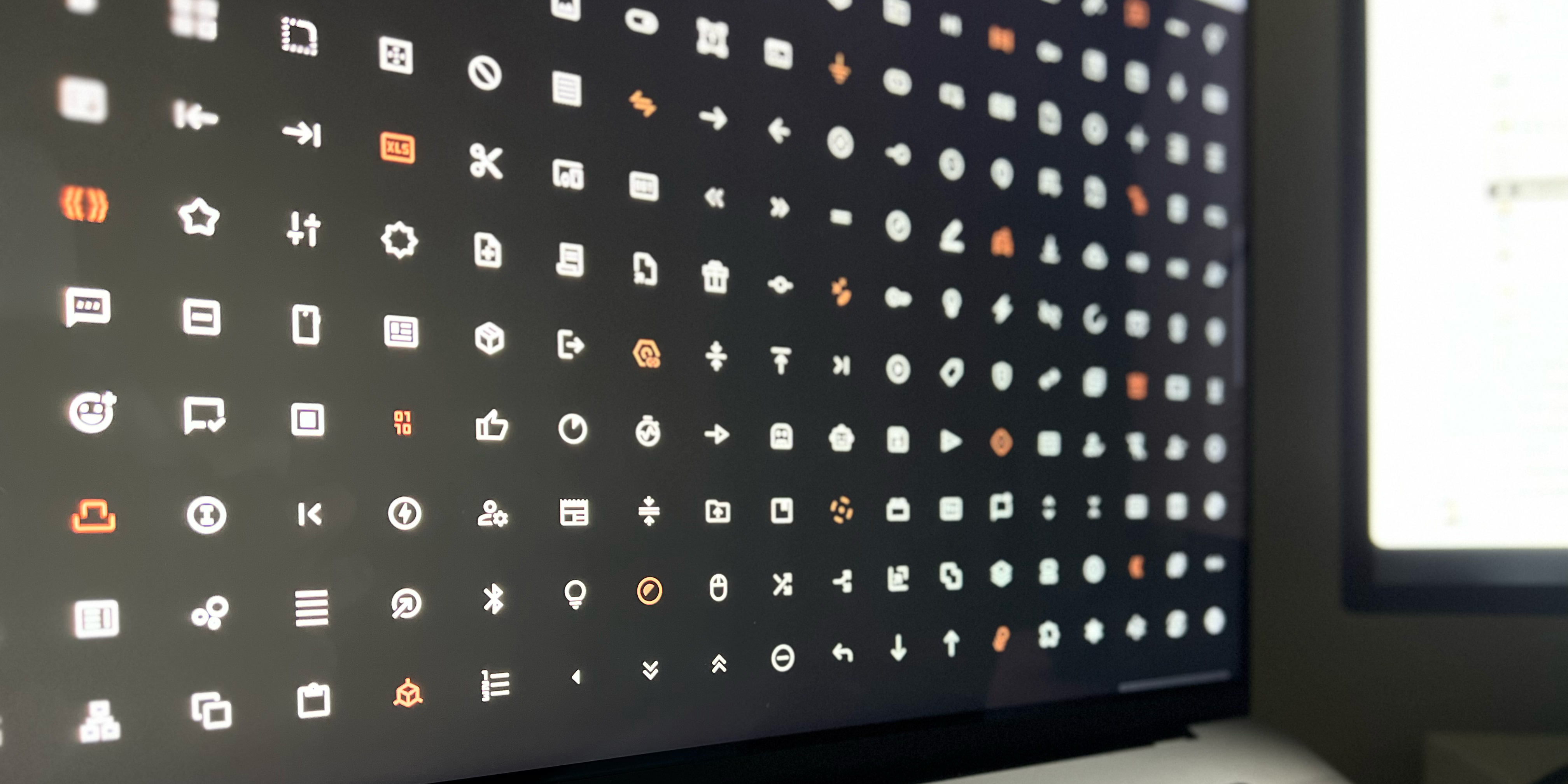
Some icons used before and after defining a unified visual language
Impact and takeaways for designers and engineers
Three lessons stood out throughout this process.
Consistency builds confidence. When symbols behave predictably across contexts, users spend less effort validating what they see and more time focusing on the task at hand. In complex systems, that predictability is foundational.
Icons encode meaning, not ornament. Some symbols tolerate abstraction or approximation. Others belong to formal systems—programming constructs, technical notation, or domain standards—where meaning is defined by convention. Treating all icons as interchangeable visuals risks flattening distinctions that users actively rely on.
Standardization has limits. Design systems are powerful, but they cannot replace domain semantics. A shared library works best when it defines a strong baseline while still allowing precision where the work demands it.
Taken together, these principles point to a conclusion: icon systems are not auxiliary design assets. They are part of the platform’s structure. Handled with care, they reinforce how workflows are understood, navigated, and scaled—supporting AI-assisted work without getting in the way of it.